


10-minute color preview input field
While the type="color" is not something most web developers need in their everyday designs, it is a bit of an input control that is all over the place and support for it is not yet stellar across major browsers and platforms.
Having a little bit of extra time, I decided to try my hand at a custom input component that can be used to input colors. It’s not as fancy as whatever Chrome or Firefox has implemented, but it’s a really simple component that lets you type in a color in any format (hex, rgb(), rgba(), transparent or named color — and even gradients) and shows you a preview of that color.

HTML: Defining the component structure
For the component structure, we want something really simple. My take on the subject is the following:
- An outside
<div>container that keeps everything together. - Two
<div>containers inside that utilize FlexBox to create a usable layout. - One
<input>element inside the first container where the user can input some text. - One colored
<div>element that will preview the color that the user inputs.
CSS: Making everything pretty
In my implementation, I used about 30 lines of CSS. What my code does is essentially the following:
- Set up the layout for the component using FlexBox. The two inner
<div>containers have a 19 to 1 ratio. - Apply some base styling to the
<input>element to make the default element look a bit prettier. - Give the preview
<div>element some base styling to make it look like a color preview element.
JavaScript: Dynamic component creation and events
The final part is to utilize Javascript to bring our idea to life. I opted to make my component modular, so I can use one function to convert any <div> element in my page into the component I just created. The afforementioned function does the following in about 15 lines of JavaScript:
- Add the appropriate class to the
<div>container. - Fill the container with the appropriate HTML code.
- Update the elements inside it to have appropriate
ids. - Add an event listener for the input event on the
<input>field to make the preview<div>element respond to input changes.
And that’s all of it. Here’s what the component looks like:

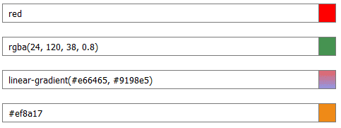
And here are some of the value formats it supports (which is basically any valid background value in CSS):
Full code for the component can be found here and there’s also a Codepen demo, if you prefer that. I also discovered that the component is compatible with Bootstrap (and probably other CSS frameworks) and looks quite decent without any changes in its CSS, so you can add it to any and all of your projects.
Thanks for reading! If you liked this article, give it a clap or 50 — It’s all up to you!