Designing a simple web page with mini.css
In this series, we will be walking through some basic ideas and techniques that will help you get started with mini.css, as well as understand the fundamental concepts behind it.

What we will be covering in this article: Typography, grids and navigation
Difficulty: Beginner (if you are already familiar with another CSS framework, you can skip to the next article in the series)
Picking up a new tool can be quite intimidating, especially when it’s one that affects a lot of aspects of your project. Front-end tools, and especially CSS frameworks, are some of the worst offenders in this kind of situation, as they usually force you to alter so much of your existing code and/or workflow. Usually, documentation is unclear, opinionated styles can get in the way and, before you know it, half your website is a mess and you have to redesign almost everything that is not pure textual content.
In this series of articles, I will try to help you get started with one front-end tool I developed, mini.css, creating some simple template projects and exploring the ways it can benefit you in the long run. Before we start though, I’d recommend you read my previous article on why you might want to try it out, as well as brush up on your CSS and HTML skills before you get started.
Typography basics
Let’s talk typography first. Mini.css provides you with a nice predefined style for all textual elements (paragraphs, headings, links, code). You can use normal HTML5 tags for everything, no classes or custom attributes needed and they work just fine out of the box. You can check out the following screencast by Per Harald Borgen for a live demonstration (it’s a Scrimba screencast, meaning you can alter or copy the code when you pause it, so be sure to check it out).
Navigation
Before you start writing articles and designing user profiles, you need to build a usable and consistent navigation menu, one that users can rely upon to move around your website. We will only be covering the basics in this article, but there will be more content about menus coming later in the series.
Mini.css’s navigation relies mainly upon <header> elements. Inside a header, you can add a .logo for your website and as many links as you want, provided that they are styled to look like a .button. Accessibility and responsiveness are handled by the framework, so don’t worry about them. I am particularly fond of the .sticky class for headers, making the menu stay at the top of the screen at all times, giving your website more of a native-app vibe.
Having said all that, let’s start by creating a navigation menu for our new social media for cats, called Catbook! The steps are really simple:
- Create a
<heading>element and add the.stickyclass to it, so that it will be at the top of the page at all times. - Add an
<a>element, linking to your cat social media’s page and give it the.logoclass to make it larger than the rest of the links. - Add a few links, like a link for the user’s profile, their friends list and the c(h)atroom. Remember to give them a
.buttonclass to look pretty.
Let’s see what that looks like then!
Grids & layout
Ok, now for the more complex part of the website. Let’s decide upon a layout first. A very simple design which works wonders for most blog-type (and other) websites is to make our content take up the full width of the screen on smartphones and leave some space around the sides of the main content on tablet and desktop screens.
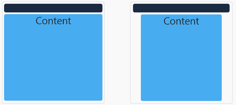
Let’s say that our screen can be divided into 12 imaginary columns and we want to use all 12 of them on smartphones and just 10 of them on everything else, meaning we should allow for one empty column on either side of the screen on desktops and tablets. The 12-column grid is the approach that mini.css takes (although you can customize it, but that’s a story for another day), similar to almost every other CSS framework on the market, allowing you to manipulate the width (in imaginary columns) of different pieces of content, based on screen size. Below you can see what we want this layout to look like:

So, let’s get used to the grid syntax before we delve into the layout itself. The grid syntax uses an optional fluid .container on the outermost level, .row elements for rows (obviously) and responsive .col-SIZE-WIDTH elements for columns inside the rows. Each column can have a layout specified for one, two or three device sizes (small — sm , medium — md and large — lg ). Columns can be fluid (take up as much space as they can) or have a predefined width (a number between 1 and 12). Finally, to simplify layout we can use the .col-SIZE-OFFSET-offset-WIDTH syntax, allowing us to create space around a column. I know this is quite a lot to take in, so let’s take it slow and apply this knowledge to create our desired layout. Note that we will be skipping the .container in this tutorial to make things a bit easier.
- Create a
<div>element and give it the.rowclass. It will serve as the outer container for our content. - Then, add another
<div>inside it. This is going to be the container for the page’s contents. - Give this last container a
.col-sm-12class. This means it takes up the full width (12 imaginary columns) of the screen on smartphones. - Now, for the rest of the devices, we could use two more classes for the width, but we can skip the one for large screens as the layout is exactly the same as the one for medium-sized screens. We want the content to take up 10 of the imaginary columns of the screen, so add the
.col-md-10 class. - Now, we also want a 1-imaginary-column space around the content, so we need to use an offset class, too. Simply add the
.col-md-offset-1class and you’re pretty much set.
After adding some content to the page, it looks like this:
Let’s polish it up
Our little cat social media is coming along nicely. If only we could apply the same grid layout to our top navigation menu. Well, actually, we can! And we can use the exact same principles. We should also add a <footer> to the website and make it follow the same responsive pattern as the rest of the content. I’ll let you figure out how to do this on your own (hint: apply the .row class to your <header> element). If you’re lazy or you’ve completed your version of Catbook, check out the sample below to see what the final design should look like.
So, there you have it! A simple website designed entirely using HTML5 and some simple classes and patterns that mini.css provides. We just covered three of the most important modules that make up the framework: Core, Grid and Navigation. I strongly recommend you click on those links and read more about them, if you want to get started creating something more complex.
In the next article, we will be covering some more interesting presentational patterns, such as Cards and the Media object pattern, which will help us create a more advanced website layout. Stay tuned!